Need help in designing responsive td column
Need help in designing responsive td column
 Aqsashahid
Posts: 1Questions: 1Answers: 0
Aqsashahid
Posts: 1Questions: 1Answers: 0
in Responsive
I am trying to build a responsive table with 'DataTable - JS'. everything seems good, except when the column data exceed in length. This is a table enter image description here 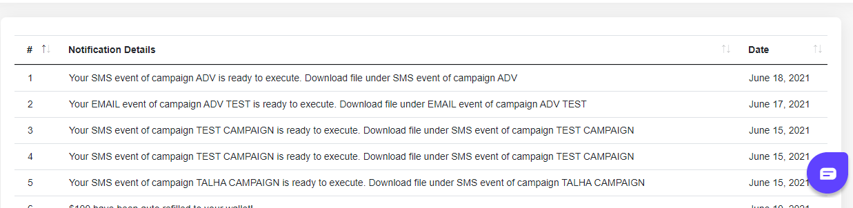
and this is when td length exceed
enter image description here 
I want to git rid of this scroll, instead of x-scroll text should display in the new row. I have also tried overflow-x: hidden; but it crops the text.
Answers
We're happy to take a look, but as per the forum rules, please link to a test case - a test case that replicates the issue will ensure you'll get a quick and accurate response. Information on how to create a test case (if you aren't able to link to the page you are working on) is available here.
Cheers,
Colin